Painting Fisherton Mill
If you are reading this, you are most likely viewing my Fisherton Mill painting, Smartphone in hand, having scanned the QR code beside it, and wondering what you'll see.
For your trouble, let me tell you a little about how it was painted...

Like all my more complex paintings, I start with a grid and map out the key parts in pencil.

I see brickwork as a balance of pink and orange with mauve and brown darkening areas - done with short downward strokes of a flat brush.

For people I usually paint the clothes first using a colour, mixing white to highlight, and mauve, brown or blue for dark areas.
For Northern European flesh I used to mix 3 white, 2 yellow and 1 red, but now I adapt flesh paint with Naples yellow and white.

The key with details is knowing where to add, and where you can get away without them. Here its the glasses and cups on the tables. For glassware paint over the background. Use white to outline the glass, and then feather it inwards, still letting the background show through.
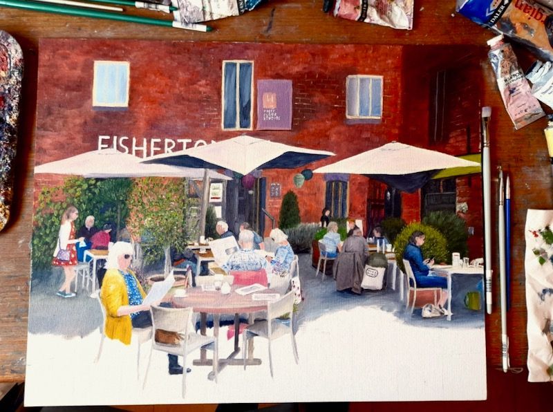
The vegetation is usually with sap green, using other hues to lighten or darken it. Our eyes are tuned to shades of green so mixing greens of different pigments usually looks wrong.
I usually dab on, using a smidgen of poppy oil to go over any rough edges of larger leaves. Here I've used light green with sap green - a rare case of two greens working together.

To finish I borrowed two planters from a second source photo, to reduce the amount of grey tarmac showing. To bed them down in the painting I darkened the area around the base of the pots, just as I have around each chair leg and foot.
